Complementary colours are pairs of colours that contrast strongly when compared to each other.
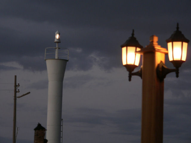
The colours are so desaturated that the blues and the oranges do not demonstrate the effect of complementary colour contrast. Your image demonstrates a duotone effect rather than the effect of complementary colours.
While I can see some complementary colors by looking at the front yellow and darker sky (although a daytime blue sky would be even more complementary), the other objects in the photo detract overall and lessen any complementary colors, in my opinion.
I like the idea of the picture, but it's a bit too soft and not enough color to really work in this challenge. I do like the somewhat industrial feel of the image though.
Blue and orange? Blue is more grey, and there is just too much background clutter. The lines are a bit skewed. Photo would benefit from a little straightening.







 Add photograph to your favorites
 Add photographer to your favorites


 Photographer found comment helpful.


