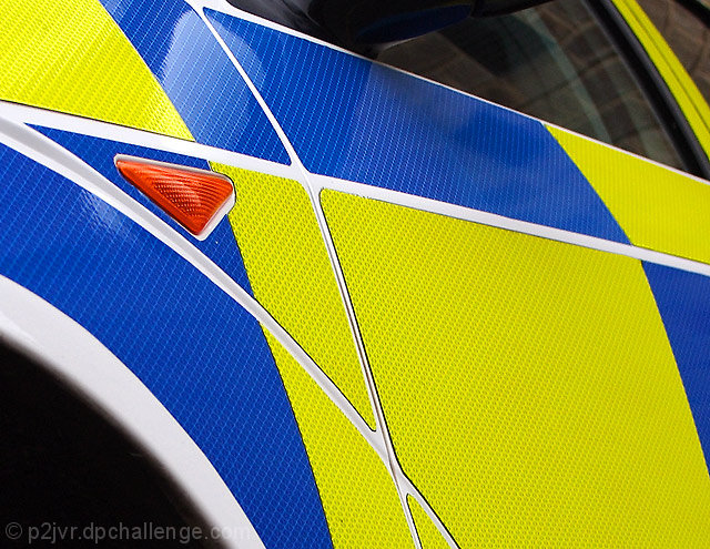
This doesn't exactly fit the criteria of complimentary colors if one looks back at the first challenge in the histories, BUT it is still bold, vibrant and just grabs your attention. The blues and yellow pairing is appealing to the eye. But I think that you could have played up more on just the color and shapes to make this a more abstract piece -rather than show it to be a portion of a cab car (IMHO it adds no appeal to the picture to see portions of the window and the upper portion of the hub of where the tire will rest - it just detracts from the color study you have going here) . I think it would have been more visually appealing if you had focused mainly on the lower left half showing the color blocks of blue and yellow along with the triangle shape created by the white lines - and it doesn't hurt that their exists a red sidelight triangle within a white line created triangle. And adding the red to a predominately blue and yellow color composition would have added a little punch of spice to an abstract piece.
This image really hits your retina (I suppose the object is designed just for that reason). I like the concept, the simplicity and the fact you have taken the opportunity (always a challenge when trying to get a good photo). Great shot.







 Add photograph to your favorites
 Add photographer to your favorites


 Photographer found comment helpful.


