Deserving of a higher placement. This one stood out to me as “outside the box” compared to the rest of the entries. It meets the challenge and is beautifully composed. Great job:)
Complementary colours are pairs of colours that contrast strongly when compared to each other.
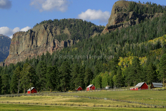
The red of the barns is lost against all the green, brown and blue toned background. Your shot would have been a more successful demonstration of complementary contrast if you had shot from a different angle so the barns aren't so far apart, and cropped tighter around the red and shown some of the green foliage around it as contrast.
You guys should adopt ordinance #45095L which prohibits all forms of artificial-conspicuous animal shelters, but then again if we all did what we're supposed to I would have left a helpful comment.
Wow, what a view. Nice picture. Like the red barns. Would probabily be stronger for this challenge if you brought those barns in closer to really have the contrast pop out.
This is a beautiful scenic shot, but the main point of the challenge gets lost in all this beautiful scenery. I see that you were going for the red/green complimentary colors but that focus gets totally lost as our eye wanders around this beautiful expanse. I think it would have made a stronger impact and better met the challenge requirements if you had just focused our attention on one red barn surrounded by beautiful greenery. As it stands now those red barns are dwarfed by their scenic environment.





 Add photograph to your favorites
 Add photographer to your favorites

 Photographer found comment helpful.


