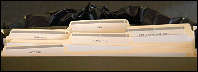
hehehe, cute! I like this a lot, at least the idea. the execution, in my opinion needs some work. It looks like you're throwing your dpc stuff away! lol..
This is funny. I think larger type on the labels would have made it more a photo I'd actually envision wanting to hang on my cubicle or something (in the dual sense of 'office art') but this one requires too close-up to make a good poster style thing.






 Add photograph to your favorites
 Add photographer to your favorites


 Photographer found comment helpful.


