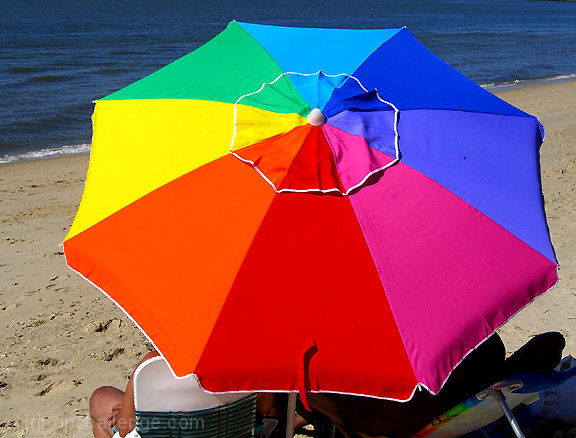
Complementary colours are pairs of opposite colours that contrast strongly when compared to each other. The challenge called for two complementary colors to compose your photograph but in your photo I see an entire spectrum of colours, and that negates the desired effect of a single predominating colour against its opposite or complementary colour.
I think your submission would have been a demonstration of complementary colours if you had chosen a subject, for example, a beach umbrella in red and green, or in blue and orange, with two main colours that are complementary to each other.
As it is, this is a fine photograph of a brilliant spectrum of colours, but it doesn't do what the challenge required.
I like this idea, it shows the whole color wheel. To me it is cropped in to tight and would have benefited showing more of the beach and ocean. But that's just me. Good Luck
I really love the shape of umbrellas. This is it's own color wheel! I wish you had incorporated more negative (sand) space on either side of it. With this setting and relatively tight crop, it kind of has a targe bullseyet effect. The clarity is good and it certainly meets the challenge. 7
This could have fit the challenge better if the umbrella had been turned to position the orange and yellow against the blue ocean and cropped closer, like one third of the upmbrella in the lower right corner. Minimalized - less is more.
Great focus, subject and lighting/ exposure!









 Add photograph to your favorites
 Add photographer to your favorites


 Photographer found comment helpful.


