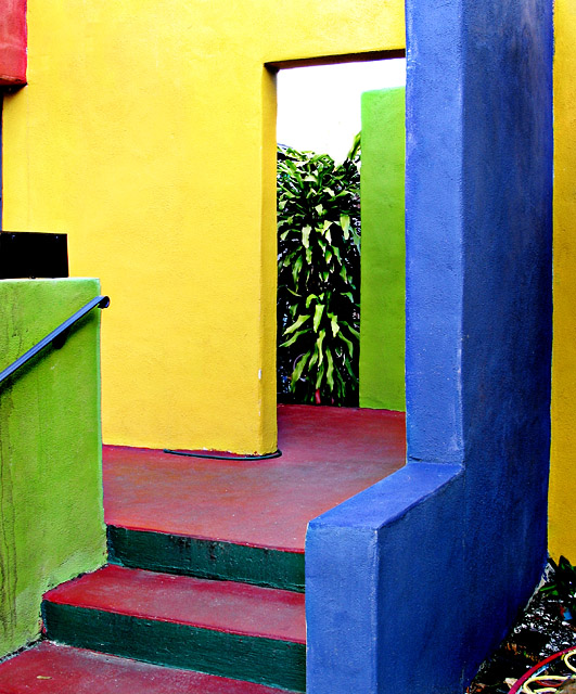
Complementary colours are pairs of opposite colours that contrast strongly when compared to each other. The challenge called for two complementary colors to compose your photograph but in your photo I see red, yellow and blue as well as two greens, and that changes the effect of tones of a single predominating colour against tones of its opposite or complementary colour.
I think your submission would have been a stronger demonstration of complementary colours if you had chosen a subject with two main colours that are complementary to each other, such as blue/ orange or red/green.
Looks like a pastel painting--really like this one. It was probably difficult the eliminate the crap in the botton right--I guess I would have brushed over that area as black--great image though.
this is nice. good job finding complementary colors rather than setting something up yourself. the background sky is a tad bright. maybe slightly distracting but i don't mind too much. i get slammed for blown-out highlights regularly myself. good job with this one.
Very cool in a lot of ways! I love the colors in this place. For the sake of a picture, this really rocks. For the sake of the challenge, picking just two of these colors might have served you better. My real complaing is the blown out sky. Might have been beter not to include it at all. Awesome shot.
Too many shapes and colors here in the composition that the true pairing of complentary colors gets lost in this bold and vibrant composition. Yes, the colors are bold and beautiful and attract the eye, but I think it could have been stronger if you focused on a central area that also plays up the shapes one sees here. I.E. centering on green wall and red/violent stairs would not only have been an abstract showing bold colors but also bold and clearly defined shapes with interesting angles.
The image contains red and green, but the overall representation of complementary colors is missing. There is a lot of clutter in the lower right corner of frame - this is a bit distracting. If you moved around enough to get the clutter out of the corner and the black out of the left center, the image would be more streamlined. Very colorful and bright.




 Add photograph to your favorites
 Add photographer to your favorites


 Photographer found comment helpful.


