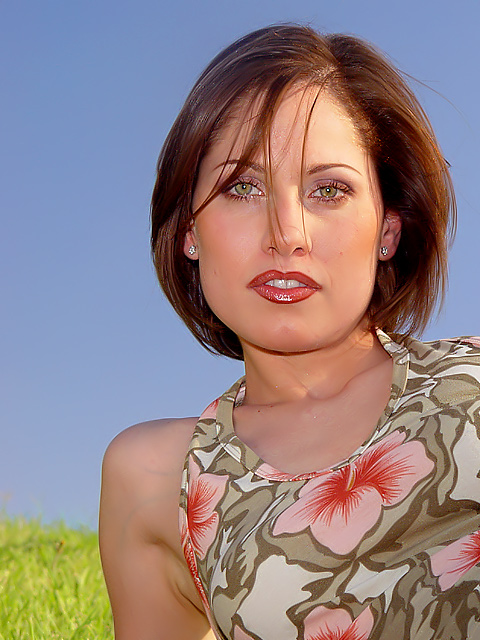
This is just part of the original photograph, so it that it can fit into the format of a magazine. I even left in some space for the text that goes on the cover.
Have you seen magazine covers that expand if you turn the cover page and open it? This is one of those! I'll post the complete photo after the challenge is over.
Statistics
Place: 14 out of 232 Avg (all users): 6.8000 Avg (commenters): 7.9778 Avg (participants): 6.8136 Avg (non-participants): 6.7874 Views since voting: 2888 Votes: 245 Comments: 52 Favorites: 3 (view)
Stunning! Focus and clarity is so perfect, I feel I could reach out and touch her. The bit of green (is it grass?) in the lower left corner is a distraction for me, but otherwise remarkable good. 8
Awesome shot. Great composition for a magazine with room for text. I would see this with the grass cloned out but of course you cannot do that for this challenge. The lighting is beautiful, just slightly textures, her eyes and the lipstick gleam and match the top ... it all looks very professional. Ribbon material if you ask me :) (10)
Superbly lit. Excellent composition and good choice of background. Not my cup of tea but scores an 8. I can visualise this on a cover. If you have local women's magazines or weekly ones, recommend submitting this as a "reader on the cover" feature.
Beautiful photograph, nothing to complain about, except for the strain on the subjects shoulder showing those couple of veins. Very picky I know, but this is a very good photograph. The light is great and so is the image.
the shadow under her chin makes her head look a bit disconnected from her body, or perhaps its that her skin looks two different colours. Strange effect anyway. Maybe a bit of fill light from below could have helped?
I think the position of this lady's neck and arm make it look like she's not attached to her own body. The blue sky is nice, but this looks NeatImaged (not a good look on skin) and somehow way more "plasticy" than I'd like. I like the overall pic, but the details are somehow 'off'.
This is one of the best shots that I\'ve seen so far. The simple yet colorful background combined with this, good looking, model would do it very well on the cover of a magazine. The dress is the finishing touch. A minor point are the veins in here shoulder/ arm; they are slightly distracting. However you probably couldn\'t remove these with spot editing. Another thing is the amount of sharpening; especially around the right shoulder one can see too much of it.
This woman is beautiful; the shot is pretty good. The lighting seems kinda harsh/bright for an Elle-style cover, the bright spot on the right side of her face is distracting. The hair should have been a little more in place too. I dont know about the choice of background....
Beautiful compsition, sharpness and the background does not distract from your subject. Your subject has the right amount of "allure" to draw reader's to open and read the magazine. Easily as good or better than ELLE's own covers.
Great composition, gorgeous model and would definitely work well as a cover. My only gripe is that the soft natural lighting coming from the sun might have worked well on it's own. The fill flash looks really harsh. You can see a bright reflection on her lips and dark shadow nder her chin - 9.
Gotta be harsh. Needs to be a little over-exposed with perfect lighting. This looks like single fill-flash. We need more than one light.. and something to reflect from the bottom.
Very nicely taken photo! The color is outstanding, as is the focus. I like the model coming into the photo from the corner, works for me! Everything looks just so perfect (helps having a beautiful model!). 10 Rob the Swash
She is beatiful. I like that you used your flash to illuminate the other half of her face. I like her skin tone. Composition is good. DOF was good.
I think I'm in love. Too bad, my wife would have a problem with that.
Wow, what an amazingly sharp image. The model is absolutely gorgeous and the photo is very nicely composed with perfect DOF. I particularly love the color of her eyes... Nice work. :)
This definately works for me as a magazine cover. There is space for the print along the side and room across the top for the magazine title. Nicely done. =o)
Beautiful woman, nice lighting. Some thing strange about her pose, is she looking down at you? Her neck seems a bit squished and there is a dark shadow under her chin, a higher vantage point would have helped with the shadow and maybe extented her neck, In this position she looks uncomfortable. Still a top notch shot!
Best women's magazine pose yet, although frankly I cannot imagine Elle putting that particular top on the front cover of their magazine (I could be wrong). Also, the grass in the background may not have been the best choice -- against sky might have been better, or a neutral background in general. Model's makeup and hair is about what I'd expect from such a photo. Crop seems about right for this magazine.
Good tonal skin colors, although there is some light on the top right of her face that is causing a few shadows, but I think that adds a more natural feel and it doesnt distract. The background choice/colors are bright and clean. The pose is somewhat odd but it adds a good negative space on the left for the usual magazine blurbs. The model is very pretty and certainly a face I'd expect to see on Elle. The image looks very professional. Well done.
niiice pic.. =) i love this one because its very simple, clear and beautiful.. obviously the girl is lovely, but the picture itself is lovely.. clear background, nice colors, good light.. BUT.. a recommendation would be take care of small details like: hair, blouse near neck and axilla.
humana, humana...... sorry, give me a sec to catch my breathe! Yes, finally a picture of a real model. perfect title too. skintones are immaculate and the focus displays perfectly on my monitor. have to give this a 10. Who is this fine looking woman?





 Add photograph to your favorites
 Add photographer to your favorites


 Photographer found comment helpful.


