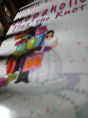
It's colorful, but the focus point seems to be beyond the graphic. No idea of what mag you're going for. The shadow bars from the rail distract from the picture. 4 Rob the Swash
Was this meant to have the title of a book-review magazine? Since it seems to be a photo of a book, and I don't see a corresponding magazine. It would work okay for that, if it weren't also awfully blurry - it looks like your camera focussed on the bits of furniture (or whatever they are) in the upper left, instead of your subject.
I'm reading that book right now! It's so funny! Okay, about photography though :) I would lighten up the shot, and keep the camera more stedy, a little tripoid would help.
It kinda looks like this a photo OF a magazine cover, not FOR one.
Aside from that... this is very blurry overall, and there looks to be some striped shadows on the left that obscure things, which for a crop this tight is not good.
The image is very small and the photograph itself is very blurry. It looks almost like a photograph of a book. It doesnt look to be straight and so the background can be seen on the top left and it's a little distracting. There also appears to be shadows across the image. I'm assuming you have a lower-end camera, and some things you could do to improve an image like this would be to use more natural light in order to help your camera focus more and thus get a more clearer image. It could also be that you held or had the book too close to the camera and the macro capabilities of your camera wasnt able to focus so close.





 Add photograph to your favorites
 Add photographer to your favorites


