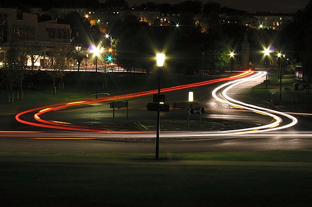
Taken from the foot of the Crags looking towards Holyrood Palace - that's the parliament buildings in the top left. Another take on the idea of an older shot:
(but different place, and trying to make it simpler).
I know the central light is quite distracting, as are the halos of the lights behind - not much i could have done in basic though :( Who knows, maybe people will like it.
I bet i'll get lots of comments about how red and white aren't complementary colours - but it's meant to be about the interplay between the red and white, and the yellow indicators, and both should be offset by the green grass. Soon see if others see it this way though.
Statistics
Place: 189 out of 318 Avg (all users): 4.8987 Avg (commenters): 4.0000 Avg (participants): 4.1754 Avg (non-participants): 5.5691 Views since voting: 972 Views during voting: 313 Votes: 237 Comments: 8 Favorites: 0
Complementary colours are pairs of colours that contrast strongly when compared to each other.
The colours in this photo are so desaturated that the effect of complementary colours is lost. Your image demonstrates a duotone effect rather than the effect of complementary colours.
Check some of the forum discussions on complementary colours for suggestions on using colour for contrast.






 Add photograph to your favorites
 Add photographer to your favorites


 Photographer found comment helpful.


