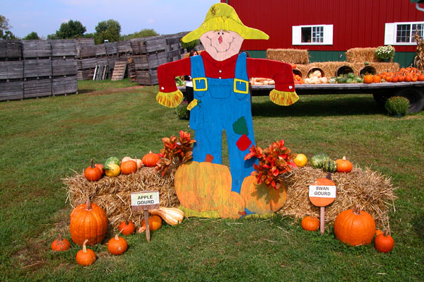
Complementary colours are pairs of opposite colours that contrast strongly when compared to each other. The challenge called for two complementary colors to compose your photograph but in your photo I see a range of reds, oranges, yellows, greens and blues that give a brilliant effect of colour, but not the effect of tones of a single predominating colour against tones of its opposite or complementary colour.
I think your submission would have been a stronger demonstration of complementary colours if you had chosen a subject with two main colours that are complementary to each other. For example, perhaps you could have cropped the subject to show the scarecrow's blue pants with orange pumpkins in front, or if you had shown green vegetables against the red barn, or the bales of hay with some brighter yellow produce against the sky.
It's cute. The crates in the back on the left are a little distracting and creates an imbalance in the photo. Unfortunately it is difficult on shots like this to get the background to cooperate.






 Add photograph to your favorites
 Add photographer to your favorites


 Photographer found comment helpful.


