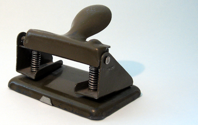
Your choice to put the stapler in the lower left third is interesting, and creates a feeling that the stapler can barely be contained. More dramatic or moody lighting would heighten this feeling even further.
Actually, I think it's a hole punch. Not too much interesting here - could have been improved with a different color background or a more interesting angle, IMO
looks more like a hole punch, but what do I know? :) Nice simple composition, but a little more negative space to the right would have punched it up a tad (rule of thirds sort of thing), no? :) Just an idea!
Seems like the stapler should be over to the right so that the front of it is more in the middle of the pic instead of being on the far left. Plus, isn't that a hole punch?
Isn't this a two hole punch? Well in any case a decent enough shot but not really compelling or anything. Sorry. I sympathize, it was hard trying to get something that had that certain something, for this challenge. I really can't see a whole lot you could do to improve the shot. 6 (BTW my second highest score made for this challenge)
Stapler? Or is that office equipment sarcasm ;o) Nice subject, nice lighting (I can imaging that a harsh shadow would look bad, but then no shadow would look boring, so good job!)





 Add photograph to your favorites
 Add photographer to your favorites


 Photographer found comment helpful.


