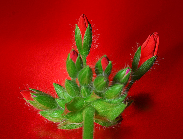
6 - Nice, good potential. Criticism; too close, or else need a more 'macro' if possible. I like the red background (difficult to match reds up), in this, green would have been nice too in my opinion but I like the effect you have gone for here, but think it has more potential, possibly with a different angle and use or elimination of shadow, etc. Extra points for correct name and spelling, but would like to have seen it capitalized - as a title.
The shadowed background works very well with the red buds and the buds are nice and sharp with nicely defined petals. Would have really liked to have seen the green leaves and stem much more sharper. The edges are a bit too blurry. ITs a good photo and thes little thing will come with a bit more experimenting. Remember most of the big ribbon winners have been at this for awhile, and are using photo programs like photoshop






 Add photograph to your favorites
 Add photographer to your favorites


 Photographer found comment helpful.


