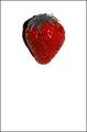
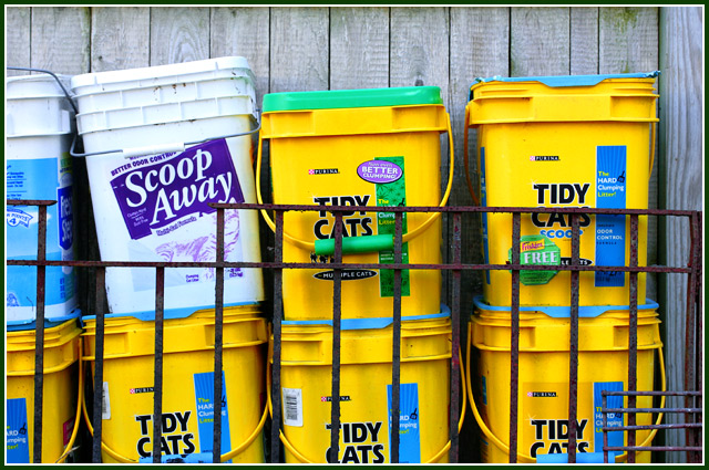
One more in my series of utterly banal "straight-shot-objects". I can't wait to watch people tell me I don't have complementary colors here, but in the RGB wheel I do, or very close to it.
Converted from RAW, virtually no PP.
Statistics
Place: 281 out of 318 Avg (all users): 4.1176 Avg (commenters): 2.8333 Avg (participants): 3.6306 Avg (non-participants): 4.5433 Views since voting: 1101 Views during voting: 304 Votes: 238 Comments: 9 Favorites: 0
All I can figure is that your challenge average was getting uncomfortably high and you threw this one in there to drag it back to earth :o). But I think I would have titled it "Scoop Away" just to be contrary - heh heh.
Even if you had gotten the colors right (and i am still trying to figure out which of the colors you think are the complements that meet the challenge), the white Scoop Away pail ruins the picture for me, unless the challenge had been something like "odd man out" but even then, I would have just chosen to let the pail with the green lid instead of the blue serve that purpose.
Complementary colours are pairs of colours that contrast strongly when compared to each other. The complementary colours I see in your image are
blue/yellow.
The challenge called for "two complementary colors to compose your photograph" but your photo shows more than two colours, violet, green, as well as neutrals black, white and greys... and that dilutes the visual effect of a single colour against its opposite (complementary) colour.
I think your photo would have been stronger if you had grouped the yellow containers with the blue labels and cropped tightly around them. The resulting photo would have been a very interesting geometric composition.





 Add photograph to your favorites
 Add photographer to your favorites

 Photographer found comment helpful.


