|
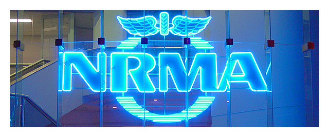
Well, it's definitely officey looking (in this case I'm assuming medical office). The logo seems to be throwing an awful lot of blue on the background, which means it doesn't stand out -quite- as much as it might otherwise, though the very bright edges obviously do. |





 Add photograph to your favorites
 Add photographer to your favorites


