Complementary colours are pairs of colours that contrast strongly when compared to each other.
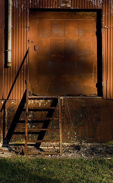
The colours in this photo are so desaturated that the effect of complementary colours is lost. Your image demonstrates a duotone effect rather than the effect of complementary colours.
Check some of the forum discussions on complementary colours for suggestions on using colour for contrast.
Your title says red vs green, but on my screen it truly looks more like rust orange-brown vs. green and therefore doesn't quite meet the challenge for me.
I liek the browns, but would've like to see more of a close up to show texture and detail on the shot. Also the big shadow "mushroom" on the door distracts. Nice shot though.






 Add photograph to your favorites
 Add photographer to your favorites


 Photographer found comment helpful.


