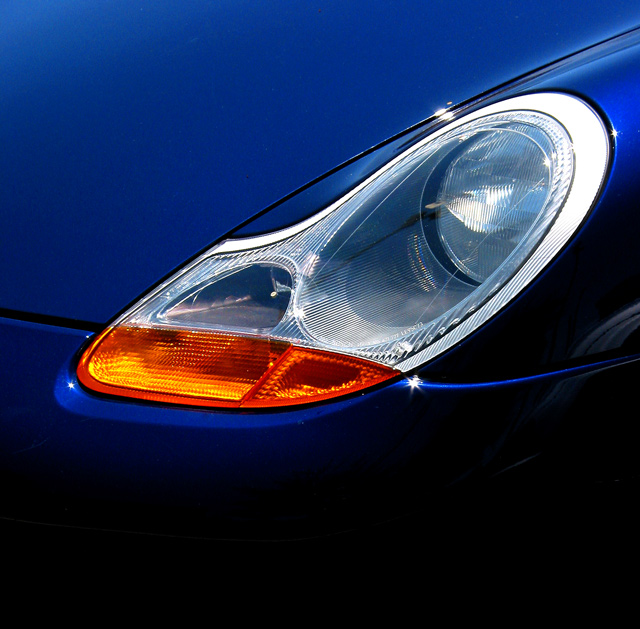
Personally I do not consider magazines to be in a horizontal shape... thats just me though. A Porsche right? Beautiful blue color, very eye catching. I like the little stars of light here and there, their cute and make you look. You lose some of your nice color in the upper corners. I could see this maybe as a cover, if you had it cropped differently, but I'm not sure how that would be. Good job leaving space for the type.
Don't know if a like tight close ups for magazine covers. Seems like more of the car should be showing. And the landscape shape of the headlight isn't good for a portrait magazine cover.
Very nice color and texture. I'm not sure I can see this composition on the cover of a magazine. Generally, the mag wants to spotlight a certain type of car. Nice pic, though.





 Add photograph to your favorites
 Add photographer to your favorites


 Photographer found comment helpful.


