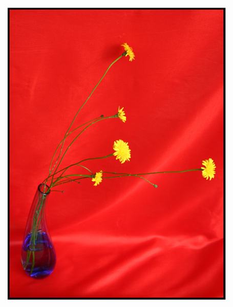
Complementary colours are pairs of opposite colours that contrast strongly when compared to each other. The challenge called for two complementary colors to compose your photograph but in your photo you have used two pairs red/ green, and blue/yellow, which don't give the effect of tones of a single predominating colour against tones of its opposite or complementary colour.
This is a great arrangement of the vase of wildflowers. But I think your submission would have been a stronger demonstration of complementary colours if you had worked with two main colours that are complementary to each other. For example if you had de-emphasized the green stems, worked with just the yellow flowers and the blue vase, and shot against a black, or white, or grey background, you would have had a complementary pair of yellow/blue. Likewise, if you had kept the red background and put more emphasis on the green stems, you would have had to change the colour of the vase---clear, perhaps? and the colour of the flowers, to a neutral white for contrast against the background.
Regardless, this is still a great composition and it works well outside the restrictions of the challenge.
Red and green/yellow and BLUE! This was very creative, but would have been more fitting had you used purple water. You still have the red and green though. I think your background needs to be smoother so as not to creat shadows and highlights.





 Add photograph to your favorites
 Add photographer to your favorites


 Photographer found comment helpful.


