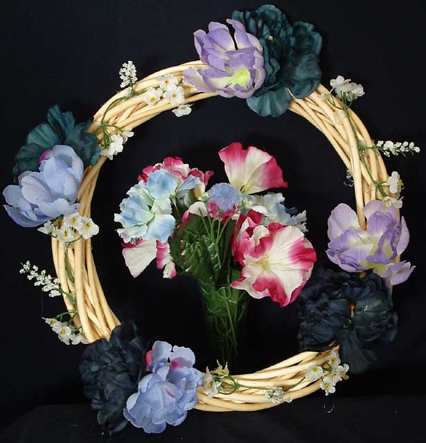
The colors are a bit weak for the challenge topic. The square crop compliments the circular composition, but the subject itself does not carry a great deal of interest or appeal for me.
This was a difficult challenge to work on... people's opinions differ on what the complementary colours are, mainly depending on whether they are working with a system based on Red, Yellow and Blue as their primary colours (subtractive colour) or a system of Red, Green and Blue (additive colour) as their primary colours.
For this challenge, I believe either system is acceptable.
Complementary colours are pairs of opposite colours that contrast strongly when compared to each other. The challenge called for two complementary colors to compose your photograph but in your photo I see red and blue as well as violet and yellow, and that dilutes the effect of tones of a single colour (violet) against tones of its opposite or complementary colour (yellow).
I think your photo would have been a stronger demonstration of complementary colours if you had replaced the central flowers with another bouquet of flowers closer in tones to violet.
Nevertheless, this is a great shot of the textures in the wreath.
Nice concept. I think it would look a little nicer if the leaves on the center flowers were spread out or moved so that they don't look as fake and squished together.






 Add photograph to your favorites
 Add photographer to your favorites


 Photographer found comment helpful.


