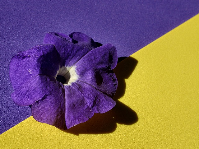
Nice bold hues on the purple and the yellow. I like the beginnings of the abstract which has a "still life" (the flower) thrown in for added interest. However I think the placement of the flower weakens the composition. I would have been better to have moved the purple flower to be in the yellow triangle area - giving the impression that the purple is escaping outside the confines/border of it's color. Not to mention it would give an off balance presentation in the colors and their positions such that it captures and holds the eye's attention. If you wanted to go for a fully balanced symetry shot it would have contained a yellow flower in the purple triangle and the purple flower in the yellow triangle.
Beautiful shot. Your complementary colors are very clear. I like the positioning of your subject, and I really like the diagonal line across the frame. I personally like the shadow too. Well done.








 Add photograph to your favorites
 Add photographer to your favorites

 Photographer found comment helpful.


