I'm voting this below a 5 and so I feel I should leave you reasons. If you're not up to it, stop reading now.
My complaints:
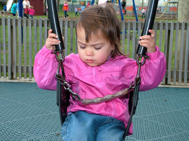
--tilted horizon
--blown out highlights
--doesn't actually fit the challenge (blue and pink are not complements, in my opinion)
--child's expression doesn't add to the image
--title doesn't describe or enhance the image
--can't discern the reason for the image
I expect you'll find this harsh. Sorry, being honest with my views.
The predominant colour in this photo is the blue in the lower half. The child's jacket needs to be more orange-yellow to provide a complementary colour contrast. In addition, the green grass and the colours of the park scene above the child's head take away from the contrast of two colours against each other.
I'd like to see the background blurred more. It would center more focus on the child. Would also like to see her eyes instead of looking down. I'm not sure pink and blue are complementary but I'm not going to judge too much on that with all the debate going on. The colors look nice together and that's enough for me.






 Add photograph to your favorites
 Add photographer to your favorites


 Photographer found comment helpful.


