|
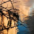
This seems a bit oversaturated to me. The colors work fine for the challange and the background showcases them well, but maybe it's the lighting. Hmmmmmm I like the diagonal sense of the branch across the "page." Maybe play with curves a bit to deepen and not just saturate? |






 Add photograph to your favorites
 Add photographer to your favorites


 Photographer found comment helpful.


