Cropped.
Levels and contrast.
Played with saturation levels on various colors - boosted the magenta, decreased everything else.
Sized.
USM.
Border.
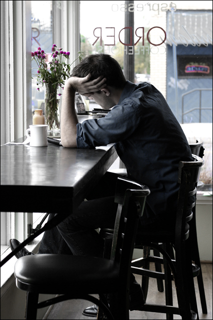
No, not staged. This was a candid.
It's something new for me, to take photos of people. I tend to stick to landscapes and still lifes. I'd like to be braver about using my camera in public. My boyfriend and I were out shopping and stopped in this place so he could get a cup of coffee. I don't drink coffee myself and while he was ordering, I turned around and saw this man. I liked the lighting and the way the man's foot was on the ledge -- snapped a few quick shots while hoping he wouldn't give me the evil eye. However he was so absorbed in his writing, he didn't even notice me and my shutter clicking just a few feet away.
Also played with my photoshop skills, doing something different with the levels and color saturation. I'm not a huge fan of selective desaturation but I wanted to draw attention to the flowers by the man's seat and decrease the distraction of the stuff outside the window. The colors in the original were pretty glaring and ugly.
The out of camera shot.
Statistics
Place: 7 out of 154 Avg (all users): 6.2492 Avg (commenters): 7.8235 Avg (participants): 5.8382 Avg (non-participants): 6.3597 Views since voting: 2518 Views during voting: 481 Votes: 321 Comments: 30 Favorites: 2 (view)
Thanks Sal. No, this was on Alberta street near where Valerie's art thing was. I took this right after I bought your birthday present in the shop next door!
good job! I think you did well. I had no idea it had been photoshopped, but now seeing the difference, i understand why. Is that the coffeeshop S took me to on Mississippi Ave?
I like the shot but I LOVE what you did with the colors- it makes me think of the 1940's. I wish he didn't have that darn juice sitting in front of him! For some reason I fixated on it a little.
I really like this picture. Most of the other entries were pretty generic. This picture actually has some emotion tied to it. I like the lighting and overall contrast. Good job. I'd be surprised if you were not in the top 5.
I think that a shallower DoF would have served you well here, helping to both freeze the motion of the author as well as blurring the shop across the street. Aside from the flowers and the red neon sign, the colors here are fairly unsaturated. While selective desaturation can serve as a powerful compositional aid, I can't see any reason for it here. If it was intentional, having some clue in your title would help to bring it out. If not, reducing the saturation on at least the red/magenta channels would help to make the image look more uniform. See [url=//www.dpchallenge.com/tutorial.php?TUTORIAL_ID=25]this[/url tutorial for info on how to selectively desaturate under Basic Editing rules.
OK, if my entry can't win, this is my blue ribbon pick. Nice and crisp, the coloring is slightly desaturated to give a feeling. It's a perfect capture of the "coffee shop". Perfect enough that I can't tell if it's a candid or posed. 10
the thing i really like about this is the feet. keeping the feet in the shot really conveys that absorption in thought...almost like watching someone playing with their hair while reading. like the composition and the slight desaturation too.
i love the vibe this photo gives off. the only thing i dont like are the buildings in the background but i know u could not do anything about that. i love the positioning of his arm and the way his foot is resting on the window sill. the flowers definitely add to the photo as well. great colors too! 8






 Add photograph to your favorites
 Add photographer to your favorites


 Photographer found comment helpful.


