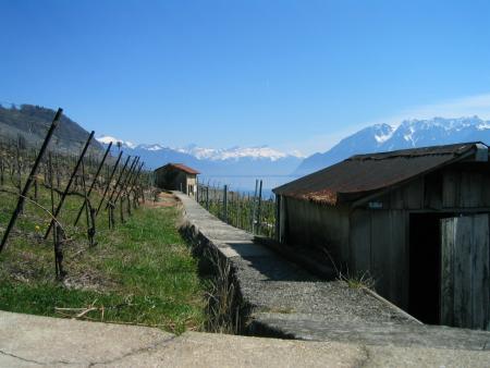
Beautiful sky and mountains in the background. The blues and whites stand out nicely. As someone mentioned the concrete wall or walkway along the bottome edge of the photo would serve a better purpose were it cropped out or had you moved enough to avoid it all together.
The other thing that really hurts this photo is the strong shadow of the building in the foreground. It is overpowering and lets you wondering just what the building looks like, shooting at a different time of day will easily correct this.
I believe this would make a very interesting magazine cover and therefore would definately meet the challenge. You have lots of room at the top for a title and the lefthandside along with the bottom would allow for print. Again that is a beautiful background.
This shot doesn't shout Switzerland to me. The ledge in the foreground is distracting, but I like your leading lines to the structure in the background.
What I dislike here is the horizontal concrete path in the foreground. I think standing a few feet to the right, at the start of the path that is going away into the distance and cropping out the horizontal one would have been better. That's just my opinion though, obviously.
Personally I do not consider magazines to be in a horizontal shape... thats just me though. This photo looks slightly tilted to me... but maybe it's on a hillside. Nice scene but I think you could have achieved a similar look by cutting out some of the left side to that back edge of the far hut.





 Add photograph to your favorites
 Add photographer to your favorites

 Photographer found comment helpful.


