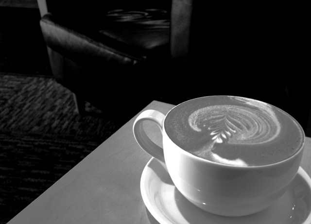
pretty coffee... imo might have been a better shot w/ just coffee and table, without seat. I'm not sure I'd have gone B&W on this either b/c it minimizes the color differential b/w the coffee and surroundings.
part of me wants to say that the contrast is a bit high. most of me loves it's effect with the cup and chair, though. that's the part i'll listen to! : ) boy would i love that cup of coffee...it's lovely. nice rich photo. i can almost see this blown up as a poster art piece!
Very nice! Doesn't even look like a picture! The pattern in the foam is exquisite! I really like the lighting and composition with chair/rug in the background. Very well done indeed. Congrats.
There are some b/w photos that are pulling off the coffee shop angle, but IMO yours would have been better in color. The swirl in the cup is lost because of the lack on contrasting color...however, the focus is great and I personally really love the corner seat approach you took with this shot. Nicely done.







 Add photograph to your favorites
 Add photographer to your favorites


 Photographer found comment helpful.


