Author Thread
Post actions
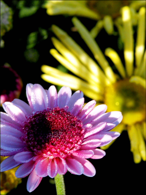
My impression - impressionistic.... highlights are hot, successful in being painterly.... colour saturation might be stronger. Frame and crop are good. This one is easy to pass over because of the softness.Message edited by author 2005-10-12 00:57:50.
Comments Made During the Challenge
Post actions
i love the texture of this picture. nice colors!
Post actions
The comlimentary colours challenge is about
Post actions
Out of focus and overblown highlights
Post actions
I think your focus is off...
Post actions
Post actions
Where is the focal point?
Post actions
Post actions
I think the complementary colors should both be in focus. I also think the light is too harsh.
Post actions
focus appears to be off to me
Post actions
Now lets see: 1 2 3 4colours, doh






 Add photograph to your favorites
 Add photographer to your favorites

 Photographer found comment helpful.


