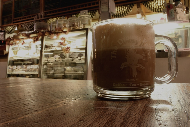
The DoF is okay, but I suspect that the woodgrain in front of the cup wasn't the intended subject. Moving the point of optical focus to the intended subject would improve this image.
de-sat it is! (not decaf if i can help it!) : )
i like the color tones in this picture, and the composition. it's a bit difficult to see the logo on the cup against the color of the drink, so i find my eyes straining there. i would be interested in seeing this picture with the lighing adjusted (so that it's not as bright in the display cases and behind the glass cup). or, i wonder if this image would show richer contrast and definition converted to a b&w?
In my opinion the de-sat doesn't add anything to this picture. There's no action or emotion in this photo, it doesn't try to tell any story. Technically it's well composed and focused, and the DOF is right on for the desired effect. There's just no "wow factor" to me on this photo.






 Add photograph to your favorites
 Add photographer to your favorites


 Photographer found comment helpful.


