Not complimentary but great contrast and really nicely done. Nice depth of field and great cropping. gave it a 7. -3 for not meeting the challenge better, but certainly not deserving of less than a 5. Oh well, they did the same to mine. Better luck to us both :)
This was a difficult challenge to work on... people's opinions differ on what the complementary colours are, mainly depending on whether they are working with a colour wheel based on Red, Yellow and Blue as their primary colours (subtractive colour) or a colour wheel of Red, Green and Blue (additive colour) as their primary colours.
For this challenge, I believe either system is acceptable.
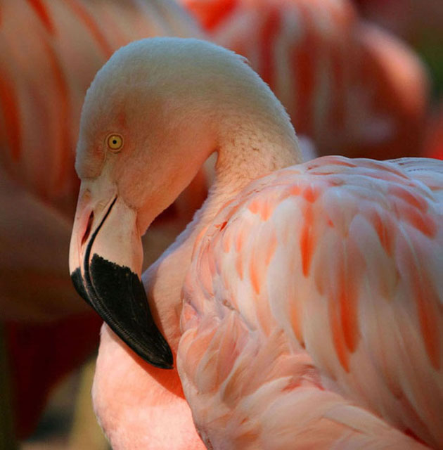
Your image appears to be composed not so much in complementary colours as in a monochromatic scheme, in that it is mostly pinks, or pale tones of red-orange. The complementary colour to this would be a greenish-blue...and in fact t his colour does exist in your photo. (Try inverting the colours in Photoshop to test this out.) However, my eye reads this cyan colour as being white highlights along the top of the head and the feathers.
Nevertheless, this is a great photo of a beautiful bird, and the colours are phenomenal! A small adjustment in the colours in the background would have made a huge difference in showing complementary colours.
This is a good photo although it lacks the sharpness and the focus is a bit soft. As far as meeting the challenge, I'm not quite certain where the "other" color is. The compliment of pink is mint green which is unfortunately absent in this image. 5
I'm not seeing complementary colors. The opposite of this peachy orange would be some shade of blue and I'm not finding it in this photograph. The flamingo is a nicely posed bird, but I think since the challenge specifically called for colors that were opposite one onother, this lacks in that regard.






 Add photograph to your favorites
 Add photographer to your favorites

 Photographer found comment helpful.


