congrats on a great finish P.. although im dissapointed it didn't finish higher.. it's perfect... the lighting is as good as it gets.... the comp is the same.. perfect... i just wish dpc'ers, would take a little more time to look at a photo when voting and really 'see' a photo, not just browse it....
::: Critique Club :::
Some will appreciate the irony of this Kiwi (New Zealander) being asked to critique an Australian entry. Our two nations are like brothers, we'll defend each other against allcomers but there's no fiercer competition than between us. So it's with some disappointent that I have received this image to critique because there's not much about it I can rubbish. I was going to make some lengthy crack about Australian stocking density rates but then decided I'd best just get on with it.
First Impression - the one you have to nail:
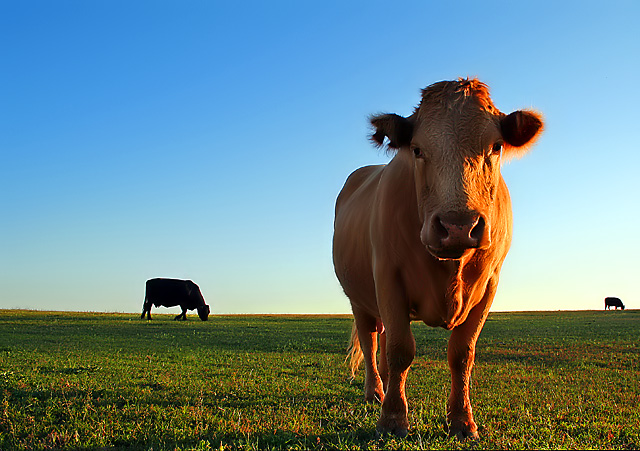
Love the humour of the title, it's part of the package and so many people ignore that. This is an atractive image. As we see from the comments, it makes people smile. It has pleasing crisp colouring, great light and it is beautifully balanced. I don't believe that you can overstate the truism that "less is more" as this image's reception shows. I do think that people may have got the wrong first impression of this image as they scanned the thumbnails and missed an important contribution to the challenge.
Subject:
In the context of the challenge the cows originally look out of place. When checking the title however, they become very relevant and appropriate. The setting by accident or design is perfectly balanced and the resulting image is the product of the photographer having a very good designer's eye and having a camera at the ready.
Composition:
This is the sleeping powerpunch of this image. People hate working under 'rules' but they have all been applied to this image - and that's why it is attractive and pleasing to the eye. The rules of composition in relation to thirds is achieved by every single element in this picture. The cow, the horizon, the eyes and the second cow all sit bang on the right spots. Just to rub it in, the "bottom left to top right" flow is there as well. It couldn't miss.
Lighting:
Because you know about light, I bet you went out knowing what effect you were going to get at that time of the day. That's half the battle won and takes out half of the chance factor of driving aimlessly looking around waiting for inspiration. The effect of that low golden light on a golden cow is stunning. Combined wth the natural complimentary colours of crisp blue and green, the result is great.
To get to Ribbon?:
When I saw the thumb during voting I thought " not another cow". It seems that just recently, particularly since "Dairy" that along with the cat, someone has managed to use a cow to depict every recent challenge. I think this shot is technically pretty damned good and would be happily snapped up by any magazine pictures editor to illustrate an agricultural story. Perhaps it didn't score higher because we're over-cowed.
Summary:
I can't find fault with anything in this image. Anything I tried to suggest by way of a correction would just be for the sake of saying something - not going to do that. I am sure there are things you could do differently with it, but those things are a matter of personal taste and it's impossible to suggest any of them without seeing the original capture. Then if you did change those things, it would not be *this* image - therefore its a wasted exercise. You can't pose cows, you can't achieve some of the suggestions made in the comments without almost trashing the whole image. The best images are built in the camera. They are polished in the 'darkroom' but the material has to be there in the first place. This is a good image, I wouldn't change a thing, I'd leave it alone.
All I can do with this critique is help to explain to others *why* it works and to point out the elements to pay attention to and to look for when framing up.
Thanks for the opportunity, its been a pleasure.
Brett
Fantastic composition and balance. Great negative space and real attention getter (front cow). Great colours and very easy and pleasing to look at. Good lighting too, easily my favourite shot so far. Adding to my favourites. I'm thinking a camera angle tilting slightly more down to show more grass in front of the cow and less sky above the head would have made this perfect for me but I still love it.
Powerful composition with interesting tension. The colours and the lighting are brilliant. The only thing that bothers me is the sharpening halo around the animal on the left.
HEE HEE Great title. I love the triplicity of it. The light is a tad harsh on the side, but I'm sure that's due to time of day. Great expression on the cow. This would make a fun poster. 7
I really like this photo. Love the low sun light shinning on the cow and the one's grazing in background give the photo depth and balance. Well done. 9
haha.. love this... looks like a real poser.. the sunlight hitting the cow is spot on... looks a little like where im from... great shot... perfectly composed with the colours and photo crystal clear.. they don't come much better than this.... 10





 Add photograph to your favorites
 Add photographer to your favorites

 Photographer found comment helpful.


