Challenge:Liquid (Classic Editing) Camera:Canon PowerShot A40 Location: My Kitchen, Oceanside, CA Date: Jun 3, 2003 Aperture: f/4 ISO: Auto (50-150) Shutter: 1/25 sec. Galleries:Still Life, Macro Date Uploaded: Jun 3, 2003
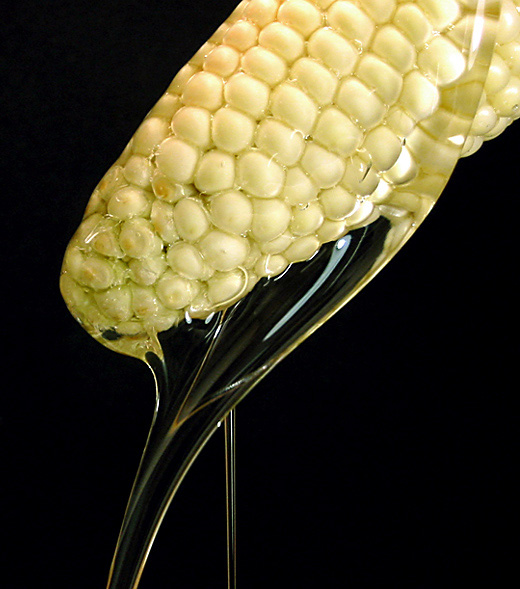
Of course, it's not freshly squeezed. :-) I poured a bottle of corn syrup over a cob of corn about 50 times till I got this nice flow. I liked the diagonal, curved line, counter-pointed by the thin straight vertical drip. It was photographed in a makeshift lightbox, lighted from the top by a 500w halogen, and from the front-right by a 60w incandescent light (which, I noticed too late, got reflected in the syrup). Tweeked levels, hues and contrast, cropped, resized and sharpened in photoshop.
Statistics
Place: 13 out of 202 Avg (all users): 6.2727 Avg (commenters): 7.8500 Avg (participants): 6.4174 Avg (non-participants): 6.1143 Views since voting: 1832 Votes: 220 Comments: 24 Favorites: 0
Thanks for everyone who took the time to vote and comment. My best effort so far! Seems I'm getting better in steps anyway.
To answer some of the comments and questions:
- The background is a piece of black foam rubber. I got it at a craft store, it was in the same section as the felt (which was what I was looking for originally - but liked this better). I only got white and black, but they had about 15-20 colors. This stuff is great, cause it totally absorbs the light and gives no reflections. Since I didn't have any colors, I thought black was a better contrast for the yellow corn and clear syrup than white. I tried at the last minute changing the black in PS, but between my lack of PS skills and general color "issues" (I'm color blind), I gave up as there wasn't time. And, ultimately, I liked the black.
- My two primary "gripes" with the shot were: the reflections of my lamp in the syrup, and the gnarled kernals at the tip of the cob. I thought it was interesting that only one person brought each of those up.
- My number 3 problem was, as several mentioned, the color of the corn. It was, in real life, a very whitish yellow. I bumped up the yellow a bit, but couldn't get the "classic" corn yellow to come out. Again, better PS skills might have helped here.
- A couple of comments mentioned trying a different angle for the corn. I did shoot it held several different angles, with the corn dripping in different directions, though I didn't try it with the corn horizontal. I just loved the smooth flow and the curve that this angle achieved. I couldn't get those kind of lines at any other angle. (I'm also curious to hear what Tim meant by "longer format".)
Oh, and yes it was very messy! After about 50 rounds of pouring, there was syrup dripping everywhere - but fortunately not on my camera.
So, that's about it. Don't know if anyone will read this, but here it is... :-)
I like this concept very much but I feel that it would be even more effective with a longer format. I would enjoy seeing more of the oil flowing off of the corn. Very well done. -T
Excellent lighting and drip control here - That is one HELLUVA bad-for-me cob of corn! Eesh! Great composition - I only wish the corn was a bit more yellowy. Great job. 9
This photo has a very dramatic look to it -- kind of unnerving, the unusual twist of source and product together. I like the lighting, composition, everything! Only constructive thing I can think of is that it would be interesting to see the background in a color other than black, to see if that cuts the harshness a little.
Lighting a little on the harsh side... probably what you intended, but it doesn't quite work for me. I love the composition, and the black background. 8
That's a clever thought, definitely. Although not bad as is by any means, I think the imperfections present in the tips of corn cobs, while unavoidable, are distracting, and wonder if you could have gotten a better effect by tilting the cob differently and taking the shot so the syrup ran over the 'sides' of the cob so you could highlight the more perfect kernels. That is really a nitpick, which is a good sign from me, really. :)





 Add photograph to your favorites
 Add photographer to your favorites

 Photographer found comment helpful.


