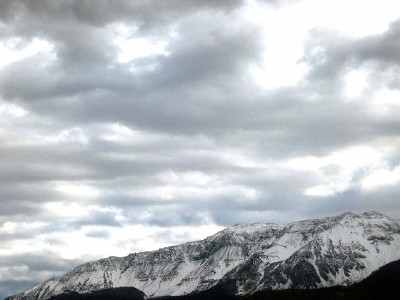
Back here in eastern Oregon, where canyons reflect the complimentary color of the sky, it all changes during fall to winter season. This is intended as a small picture with an ambitious display to scale a large portion of land and above it.
Statistics
Place: 307 out of 318 Avg (all users): 3.4364 Avg (commenters): 2.0000 Avg (participants): 2.9915 Avg (non-participants): 3.8814 Views since voting: 976 Views during voting: 302 Votes: 236 Comments: 17 Favorites: 0
Did you mean to enter this in the complementary colors challenge? If you did, you missed the mark.
If you intended it for the "Your corner of the world" challenge (which I suspect), I'd probably give it a 4 or maybe a 5, because, despite it's title, it appears to be mostly a picture of a sky, one with nice texture, granted, but a sky with nice texture could be found anywhere.
Complementary colours are pairs of colours that contrast strongly when compared to each other.
Black and white are neutrals and not colours at all, and therefore they cannot be complementary colours... white shows the presence of light, and black shows the absence of light. Black and white areas next to each other do demonstrate high contrast, but high contrast gives a different visual effect than complementary colours do in a picture.
Your image demonstrates a duotone effect rather than the effect of complementary colours.
Check some of the forum discussions on complementary colours for suggestions on using colour for contrast.
Where are the contrasting colors? Black and white are not true colors. The shot is way too small to work effectively. I'd make sure the dimensions are 640 pixels at the highest point and it will create a larger image. This would work better in true black and white with high contrast, but not in this challange.







 Add photograph to your favorites
 Add photographer to your favorites


