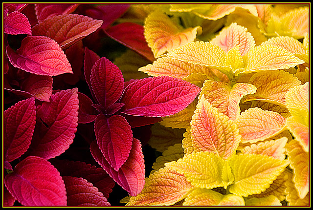
Thank you.. i got the colours slightly wrong and its down to my bad eyesight, for sure i thought i set the hue to make it look more purple than red but everyone says its red and yellow, sorry about that.
Thank you for the after support and Phillip always I am happy when you like my shot because I have so much respect for your photography.. by the way my site is finished and has changed a lot you should visit again we miss your pictures there please visit again
Marac!!! Dude, this is not just my favorite shot of yours, but it was by far my favorite shot in this challenge. 26th place is cool, but this one deserved much higher.
26th!? arrrghhh!! This deserved top 20 for sure, and higher than that in my own rankings. the depth of color and tonal range is just so lovely, and the focus is dead on. even better because it's something you found already out there rather than having to create in a studio. excellent work, in any case.
Complementary colours are pairs of colours that contrast strongly when compared to each other. Unfortunately, the yellow colour you show on the leaves on the right hand side of the photo is not the complementary colour to the red on the leaves on the left... you would need to have a more blue-green tone on the right to achieve the complementary pair of red/green, or a more blue-violet hue on the left to achieve the complementary pair of yellow/violet.
Regardless, this is a superb close up photograph, and I admire your skill in arranging the composition, despite the fact that it didn't meet the requirements of the challenge.
Wow, beautiful plants. I can't grow them at all. Love the colors but they are not exactly complementary. Also, the sharpness seems a bit high. Nice composure though






 Add photograph to your favorites
 Add photographer to your favorites

 Photographer found comment helpful.


