Your treatment of this picture makes it look out of focus and grainy on my monitor.I do like the idea of the shadowthough, but not the quality of the result. 5
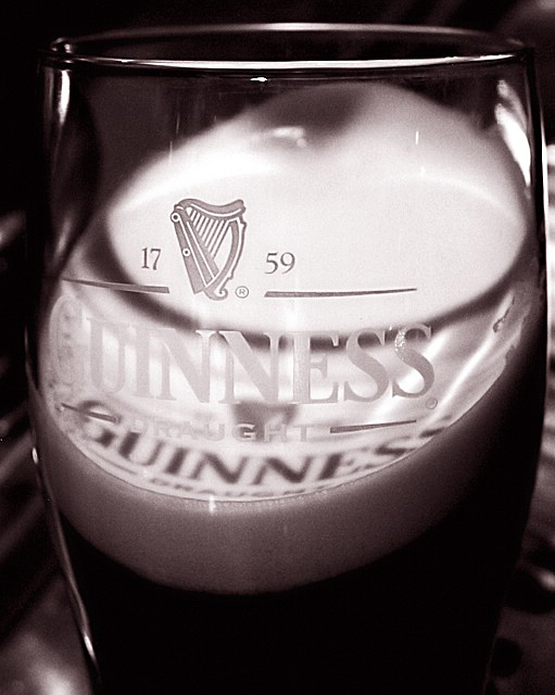
I like the composisition but find it dificult to see the liquid. If I didnt know what guinness was (much to well I may add ;-) thend I wouldnt see it as liquid at all. Still overall I do like this photo.. Good job
While this is a nice picture, you dont really see any of the liquid. (oh ok, a small portion at the bottom) Since this is a liquids challenge the emphasis of the image should be placed on the liquid, not the label on the glass holding the liquid.
Nice shadow. Looks like your Guiness glass has actual guiness in it too from the tone and the foam, though that's harder to tell in B&W since you can't see the chewy brown colour. I like the tilt. Top right there's some light reflection that's a little distracting, and not sure what that background is but I think a more solid colour would have suited slightly better.
Nicely done - I like the completeness of the text on the head, good camera angle chosen. Just one point, though. I'm aware that (properly draughted) Guiness is legendary for its stillness due to its thick consistency. The glass has been titled, to allow the text to reflect onto the head, but there's no other sign of that. Just a point that niggles me.






 Add photograph to your favorites
 Add photographer to your favorites


