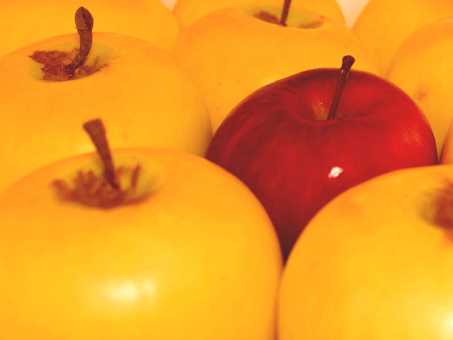
Complementary colours are pairs of colours that contrast strongly when compared to each other. Unfortunately, the red of the single apple is not the complementary colour to the yellow of the rest of the apples... you would need to have a more green tone on all the other apples to achieve the complementary pair of red/green, or a more blue-violet hue on the single apple to achieve the complementary pair of yellow/violet.
Regardless, this is an eyecatching arrangement, and it could have done well in another challenge.
I like the concept, but the orange/yellow cast is so very....bright (for lack of better technical terms), I feel the need to squint a bit when looking. Also, a bit more sharpening or focus on the red apple itself would help boost the overall appeal.
Nice idea but a bit of fill flash would have improved it a lot. The overall yellow cast from the lighting spoils it and it looks a bit soft overall. Maybe bouncing the flash off the ceiling to avoid too much flare on the shiny apples?






 Add photograph to your favorites
 Add photographer to your favorites


