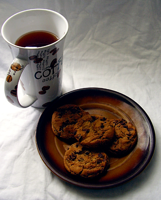
You've got a decent composition here. I might have put the cookies on a different colored plate so they would stand out more. The lighting is uneven across the frame, and doesn't seem to highlight any portion of the composition with intent. Lastly, the tablecloth is very wrinkled which detracts from the overall visual appeal. Overall, this is a decent shot that didn't meet it's potential.
1. The cup is blocking the lightsource from getting to the cookies and that makes them a bit drab and lacking in texture, I would have liked this shot better if the cup were in the top right corner, not the top left.
2. The backround isn´t exactly fitting with the challenge theme, makes it pretty obvious that you took this at home since it´s just a wrinkled sheet but I didn´t vote as it was off topic.
I like the rest, the lighting is good (if you exclude the cup in front of the lightsource bit), the image quality is good, the colours, sharpness and contrast and composition is above average. Gave this a 6.
Im not that fond of arrangements... but the sharpness is ok, and so are the colors. A shadow on the cup could have been avoided, and the angle better if taken from a lower point.
I like this idea with just a few changes. A plate theat is a different color than the cookies. A smooth background and a plain coffee cup. I would have liked to see this pop with color.
cookies and coffee this is truely a scrumptious meal! i dont know how easily it could be accomplished but perhaps a less crinkled cloth would improve this
Cookies and Coffee - I'm on my way now. Great idea for the challenge and the cup design is too cute. Great use of color and spot on focus. Would rather have seen a table in lieu of the cloth to give it a bit more of a coffee shop feel - regardless nicely done.
I love this, the colors are beautiful. The only two thing's that bother me is the lighting, the glass's position is quite wrong, you should have put it on the right side so it wouldn't block the light. The second thing is the background, really doesn't fit the subject, you should have chosen a different background or put a glass on top of it. Still great photo with big potential.





 Add photograph to your favorites
 Add photographer to your favorites

 Photographer found comment helpful.


