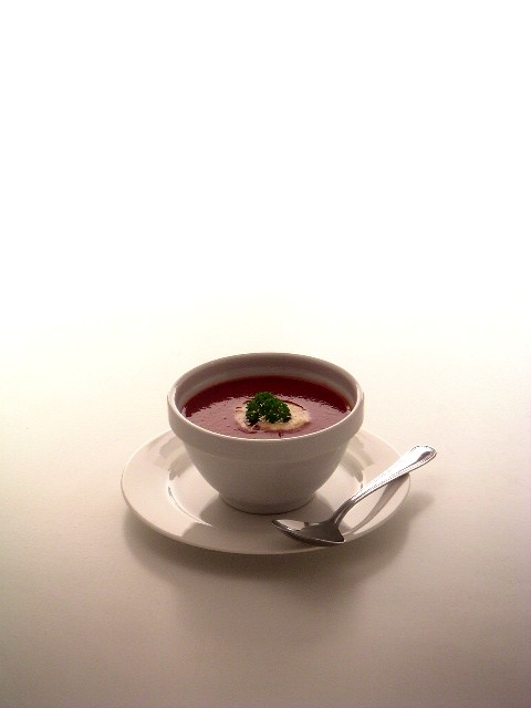
I love the lighting on the background, but I wish there was just a bit more lighting up the soup itself. That part of the shot is a bit dark, but overall, I like the symmetrical compsotion and the inclusion of negative space. well done.
I like your choice of topic and the basic setup of the soup/bowl/spoon, but there's far too much negative space here; a tighter focus on the bowl would have been preferable.
This would be greatly improved with a tighter shot of the bowl of soup, because you have all the elements you would need to tighten it and still have a good photo.
For a bowl of, say, tomato-banana soup, presented like this on the menu, if service and ambience could match the immaculate attention and care of the photographer... I'd be obliged to pay dearly and tip genourously.
Given the 'emotive' limits set by the challenge, I vote in the same spirit.
Beautifully clear photo with good focus and I like the way the foreground fades into the background. I just wish there was more of an interesting background to look at as there is so much empty space in the top half of the image. In addition, I find the red of the tomato soup to be lacking pizzazz. Maybe a spot light on the soup alone would have brought that out some more or some increased saturation in an image editor. Well done.
This image is just so... pretty! The composition, with all that white space, is very unusual. But it WORKS because of the symmetry and formality of the subject!
It doesn't exactly scream "liquid" to me, but it definitely meets the challenge requirements and leaves an impression, in a positive way.
At first, I didn't like the fact that the white background goes from brighter ot darker from the top of the image to the bottom. But the more I look at it, the more I like it. Good job. :)
Arguably, it's not the most exciting of topics, but I like this a lot. It's refreshing to see a nice, simple shot. It easily looks like something that could be used in an ad of some type.







 Add photograph to your favorites
 Add photographer to your favorites


 Photographer found comment helpful.


