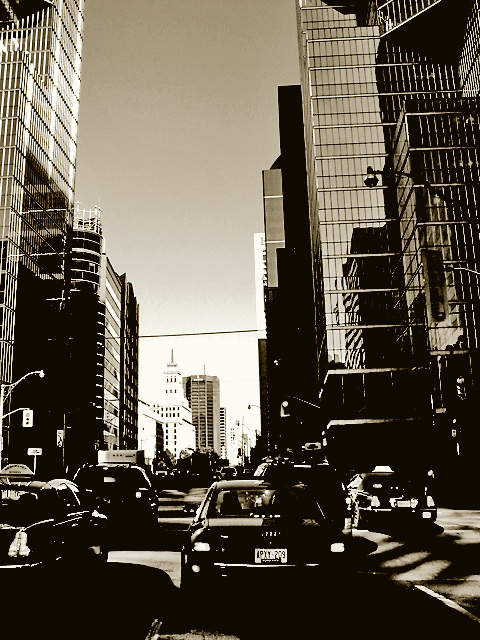
hmmm... I'm sure you have gotten lots of complaints about the processing on this. It is not to my taste, but I do think it has it's place. It does have a good dirty feel to it. perhaps some grain would have helped make it better? I dont know. The treatment makes it look dirty, but the particular part of the city you used is very clean.6
I love this kind of image. You've made 2005 look at first glance like 1945. Or maybe 1955. The point-of-view, from behind the cars, is unusual and effective. And the high-contrast treatment is terrific for the subject. Given that it is advanced editing, and also that you have clearly post-processed the image a little to attain the terrific visual effect, I will be very interested in any comment you later make about the decision to leave the wires in. I don't object to it; I'm just surprised. 8.
The tonal range looks very limited on the bottom third of this, ends up confusing the eye. Not sure I like this type of processing... Lovely sharp focus on the buildings though. Might have worked better if you'd cropped out the cars.
hmm... at first glance this looks like downtown toronto. *spotting ttc sign and confirming it is* :) I like the high contrast post-p which gives it a very artistic look.





 Add photograph to your favorites
 Add photographer to your favorites

 Photographer found comment helpful.


