Complementary colours are pairs of colours that contrast strongly when compared to each other.
Black and white are neutrals and not colours at all, and therefore they cannot be complementary colours... white shows the presence of light, and black shows the absence of light. Black and white areas next to each other do demonstrate high contrast, but high contrast gives a different visual effect than complementary colours do in a picture.
Check some of the forum discussions on complementary colours for suggestions on using colour for contrast.
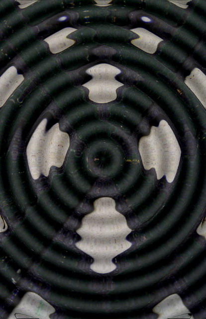
I find this an interesting photo and effect. As for the colors though, to me they are too muted and dark, and I can't quite tell if that's a very dark forest green and maybe a darker violet? I wonder if a stronger light source or additional sharpening would increase the overall color effect?
What am I looking at? Water drop over a black background with white circles? I like the abstractness of it. But it feels like it could use a bit more punch/cleaness to the blacks and whites.







 Add photograph to your favorites
 Add photographer to your favorites


