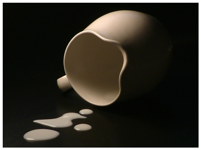
Not an inspired entry I don't think - I tried a much more colourful shot with oil, but couldn't get the viscosity to come out, and this really is a last minute effort. Like the mood - there's just a key-light and tiny little fill-in that barely registers, so the shadows are more extreme. and this isn't a macro - it's shot from about two metres away with the zoom and a bit of sharpening - didn't want the perspective distortion in this shot.
Statistics
Place: 6 out of 202 Avg (all users): 6.7014 Avg (commenters): 7.9565 Avg (participants): 6.6957 Avg (non-participants): 6.7075 Views since voting: 2538 Votes: 221 Comments: 25 Favorites: 6 (view)
I really like this shot, not much I could suggest for improvements. The focus and lighting (the lighting makes this shot) seem perfect to me. The composition also doesn't seem to need any improvement. The only suggestion I could give that would be an improvement would be to emphasize the spilt milk with more brightness. This could be done with pre-processing lighting or post-processing adjustment of some type (select the milk only and crank up the brightness, or any better method).
One other comment. I'm sure you are talking about "Don't cry over spilt milk" in your title, but what about the "Please?". I have no idea what you mean by this part of the title. Of course, I could be missing something, but I can only tell you my feeling.
The lighting on the spilled milk is a little dull. Would prefer the milk to be a brighter white. Nice lighting on the jug, good composition and capture of detail.
Great picture - I like the simplicity and the lighting - there's a lot of darkness and shadow that evokes a little bit of emotion out of me :) Cute title too.
More natural looking than many spilled f00 shots. The milk inside the pitcher is tough to see due to colour of the pitcher, but the trade-off there of course is the use of a contrasting colour against the background. Lighting is interesting although given the choice of a set of contrasting objects perhaps giving a little more light to the right side of the pitcher would've been a little better? I don't dislike it as is.
Great image, although the mil looks a little dark on my monitor. Great idea and wonderful lighting. If not for the color of that milk this would be my favorite. Still, this is wonderful!!
Very very nice. I like the lighting and the curves of the pitcher. Only criticism I would have is that I think a little more light reflecting on the spilled milk would have made this perfect. 9
There's something almost painterly about the lighting in this. I like the way the pitcher sort of disappears into the background. Would consider either no frame or making the frame off-white instead of pure white.
Wow, this is remarkable soft lighting. The milk looks a little off-white, what liquid is this? It looks as if great care was taken in all aspects of the set up, and for that reason the odd-shaped droplet throws me off. Not to say that all the pools should have been uinformly round, the odd shape is crucial, but just that in a shot with a studio feel such as this, even the irregular or randomly shaped elements need special care to preserve harmony. Something about the way the left tail kind of narrows to a point? I can't really finger it. I KNOW it sounds like nitpicking, Im just relaying what my eyes told me. It was the 'only' thing that detracted. Fabulous shot. (9)
Nice composition, title and focus...I only have an issue with the light. The milk is grayish/flat looking color. Still this is nice and it is obvious it's milk. Good job.





 Add photograph to your favorites
 Add photographer to your favorites

 Photographer found comment helpful.


