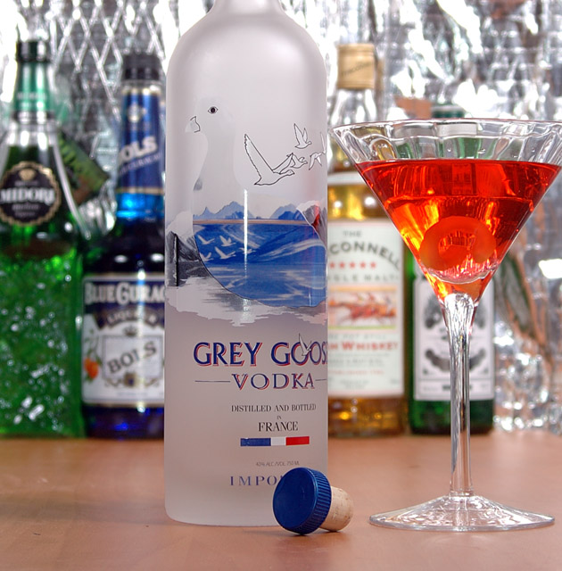
Again taken in my "basement studio". First challenge entry with my new D70. This was originlly a test shot, I was planning on setting up a backdrop, but my wife said she REALLY liked the metallic background, so I'm entering it. 2 Alien Bees strobes, one on each side.
Post: Crop, Auto Levels, Resize, Save As...
Hope you like it!
Statistics
Place: 64 out of 206 Avg (all users): 5.5684 Avg (commenters): 6.4167 Avg (participants): 5.1299 Avg (non-participants): 5.7834 Views since voting: 1177 Views during voting: 336 Votes: 234 Comments: 16 Favorites: 0
The framing and the POC view of this image are well chosen. You might have included all of the orange glass though, or cropped out some more. This creates a 'chopped off' impression. Also, your background is too busy because the text on the bottles is still readable. You would either have needed a far narrower DOF, or bottles with less prominent labels.
FIrst of all, my wife and I nearly came to blows over the background, and for the sake of marital bliss, I gave in. I was originally planning a shiny black background, or maybe some wood paneling, but she liked the metallic (it's actually the insulation that hangs on our basement walls!). It seems that you either love it, or hate it, and it's about 50/50 each way. Not suprising.
About the composition... I definatley should have put another bottle on the right side. I think the shot was made at a slight angle, which only made that space look bigger than it really was. The crop was done the way it is because of the space between the Grey Goose bottle in the foreground, and the rest of the bottles in the background was really about 4 feet, in order to get the depth of field right. If I had left any more of the top of the Grey Goose bottle in there would have been a huge field of the reflective background behind it, as the background bottles appeared much shorter, because of the distance. In hindsight, I could have put them on a riser to elevate them. Likewise, cropping off the glass, because of the angle, to avoid gigantic empty metallic space. Besides, I kinda think it works, but I appreciate the opinion of those who disagree.
Finally, anyone who drinks martinis, knows that the lemon twist goes IN the glass, not ON the glass. :)
I love the colors in this picture. Although I would've left the lemon rind on the glass and not in it and I would've put one more bottle in the line-up.
Nice choice of depth of focus. The colors are bright and have a nice contrast to them. Overall the photo is a bit busy. Maybe a different backdrop, with less texture would help.
Nicely lit and good sharpness, technically this is pretty well done. However, I have to put a questionmark about your composition, I don´t understand why you have all that room to the left of the vodka bottle and then cut off part of the martini glass on the right, I would have liked this shot a whole lot better if it wasn´t like that and also I feel that the top of the bottle should be in the shot. Just my 2 cents and if you disagree I totally respect that, this is just my opinion. (5)
i don't think the bottles in the background add anything to this picture, at least not with silver backing there-it gives it a kind of "cheap" feel to it and not a top shelf feel.
But i do like how the cork is laying there :-)






 Add photograph to your favorites
 Add photographer to your favorites

 Photographer found comment helpful.


