Author Thread Comments Made During the Challenge
Post actions
Post actions
Post actions
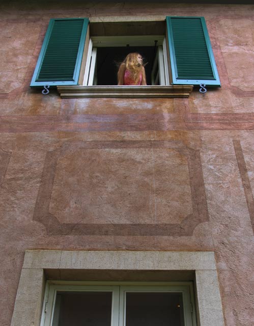
Great perspective. It looks as if the focus is a little off - it seems sharper a couple feet lower on the wall.
Post actions
Love the colors and textures in this photo. Would like to see the subject placed more to the left in the window. Good job!
Post actions
Excellent idea, but I think the point of focus was a little off. I would have tried cropping the upper window to the left and use the rule of thirds.
Post actions
The bottom window distracts me a little, but I suppose this couldn't be helped. I love the colors and the title though!
Post actions
Post actions
love the fact of the girl in the window. really makes it.Message edited by author 2005-10-05 17:51:26.
Post actions
I vote that you crop off that bottom window/door. It's unnecessary, and doesn't add to the composition.
Post actions
I like the idea of this shot. The color and texture variations add interest. My main complaint is that the window frame isn't parallel with the bottom of the photo's line. It could be easily remedied by straightening out the shot. With the subject being farther away, it might be difficult, but I wish she were a tad bit more focused. Love the turquoise shutters!
Post actions
I like how the colour of the windows draw you in with the girl framed in the middle. Nice work.






 Add photograph to your favorites
 Add photographer to your favorites


 Photographer found comment helpful.


