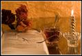
Beautiful colors. I would have straightened the image and put put the bottles on the right instead of the left of the picture. Overall very nice picture.
I think if you had spaced these out a bit more it would have improved the composition. Not a bad shot, but the placement of the bottles could be improved.
While "beverage" is clearly suggested with the familiar repetitive labels, the darkness of the overall image looses essential definition that might have made a bolder statement of the theme. Yet, this might have rendered your image "typical." Such is the joy...and the quandry...of aesthetic choice.







 Add photograph to your favorites
 Add photographer to your favorites

 Photographer found comment helpful.


