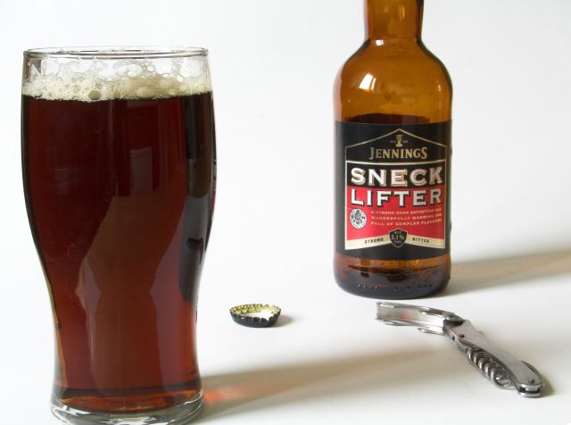
cropping is too tight, why cut off the neck of the bottle and the bottom of the glass when you already have so much white space? Good colors and shadows.
I think you have a choice here in composition...a) using more negative space, therefore giving more a sense of place to the assorted objects...or b) bringing the obects closer together and doing a major crop in the lens. Right now, it seems too much halfway between, so there's nothing really holding it together.
The crop on the top of the bottle looks pretty good but I wish you hadn't cropped the bottom of the glass, it makes the whole thing look a little disproportionate.
Good composition for me. I wish the glass wasn't cut off at the bottom, but I like the lighting and colors. Having the cap and opener adds interest as the photo would be boring without them. Well done and good luck in the challenge.
Not too bad. 6. I think in this case the reflection in the glass hurt the composition as well as the light reflection on the bottle. Also feels like it needs to be rotated a few degrees clockwise.







 Add photograph to your favorites
 Add photographer to your favorites


 Photographer found comment helpful.


