Author Thread
Post actions
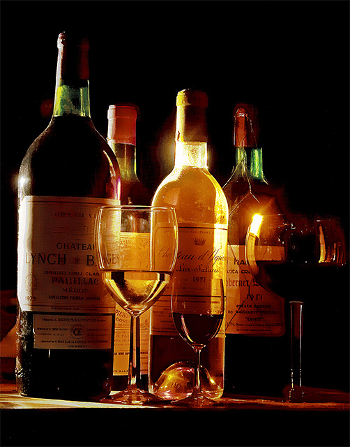
Thought this would end up in at least a top 5 if not ribbon winner. This really is a great shot, so don't get discouraged.
Post actions
Thought this would place higher. I love the lighting and colors of it.
Comments Made During the Challenge
Post actions
Very good work in composition and lighting effects. I'm disappointed that everything is on a tilt as I would liked to have scored it higher
Post actions
I'd like to see a little more light on the labels. Really good otherwise.
Post actions
I really like the lighting, the composition and especially the subject! The only niggle is a perceived slight tilt to the right. 8 from me.
Post actions
This is an excellently executed phot and layout. The lighting is very effective as is the overall set up of the bottles and glasses. I was originally going to give this a nine but upon a second thorough viewing have gone up to the elusive '10'
Post actions
HAHA. This looks like an Iron Chief selection. HAHA
Post actions
Nice effect but a bit too dark.
Post actions
Nice lighting, very sharp, I like it;)9
Post actions
Post actions
Great shot. Like the way the words are magnified through the glass. Great lighting.





 Add photograph to your favorites
 Add photographer to your favorites

 Photographer found comment helpful.


