Critique Club
Hi Johnothan,
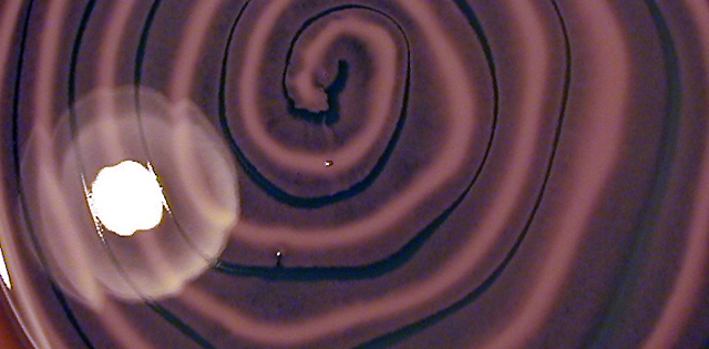
intersting image and choice of cropping. It is certainly abstract and I think it probably scored lower than it should have. I like the design.
One thing that does detract from the image is the couple of little white spots on the inner two swirls. I take it that the big white spot is the reflection of the lamp you used to light the picture. I think it both adds and detracts from the image. Firstly I think it adds something to the surface effect giving a sense of the irregularities in the surface, though at the same time it is distracting and probably cost you a few votes. It seems fairly grainy which may have been the effect you were going for. Personally I think I would have perhaps used a longer exposure to lift the image a bit and moved the lighting source out of the direct line of the shot.
Perhaps a longer exposure at a lower ISO would have reduced the grain. Finally increase the saturation to make the colours a bit more vivid.
Compositionally, I think it is a good abstract and thew swirls do lead your eye to the centre of the image.
I think it would be worth reshooting this to see what else you could get out of it.
Overall I think a few technical and compositional changes would have resulted in better scores for this image.
Thanks for sharing your image and keep shooting.
Cheers,
Todd. |





 Add photograph to your favorites
 Add photographer to your favorites


