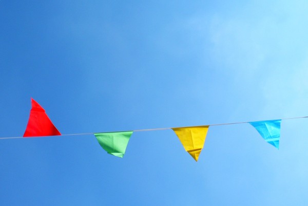
I can appreciate minimalism at its best, but I'm sorry to say that I don't think this is it. The red kite is over-saturated (as is the entire picture, it's just very noticeable with the red kite), and it seems that the shutter was kept open too long, and the subject is not quite in focus.
Ya know, this is very simple, but I really like it. For me, it has a good graphic quality about it. I also like how the red flag is up and the others are down.






 Add photograph to your favorites
 Add photographer to your favorites


 Photographer found comment helpful.


