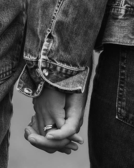
Sort of a self portrait of me holding my wife's hand. I composed the shot with me out of the scene and then ran up to my wife and triggered the shutter remotely ... all while my son bombed us with his Spiderman toy from his fort.
Photoshop Processing:
- RAW conversion
- Crop to 4:5 ratio
- Curves Adj. Layer
- Flatten
- Hue/Saturation Adj. Layer
- Channel Mixer Adj. Layer (Monochromatic)
- Curves Adj Layer
- Flatten
- Duplicate Layer created
- Apply Gausian Blur to Background Layer
- Make Mask to Background
- Select RGB Channel
- Hue/Saturation Adj. Layer
- Curves Adj. Layer
- Selective brush out of unwanted editing
- Flatten
- Dodging & Burning
- Resize
- Very slight USM
After the vote:
Wow, a top 10 finish. Thank you to all of you who voted and left comments! Very cool to have a top 10!!! I'm also very please that I didn't receive a single 1, 2 or 3 vote on this shot. Thanks you!!!!
Statistics
Place: 5 out of 211 Avg (all users): 6.8142 Avg (commenters): 7.5714 Avg (participants): 6.5588 Avg (non-participants): 7.0242 Views since voting: 3321 Views during voting: 327 Votes: 226 Comments: 23 Favorites: 4 (view)
I press the 'give me an image to critique' button around here occasionally. I'm usually immediately blasted with some lame photograph that appears to have no rhyme or reason to it other than meeting the challenge. Sometimes the challenge is even sketchy in the image. I actually voted on this challenge, and I gave this photo a 10. I liked it just as much as the photo that got first place.
I can't really offer you much critique. I like the image just the way it is. All I can do is offer you some ideas that you may not have thought about. I like to evaluate post processing choices. When I modify a photograph, I do it for a reason usually. I am also a fan of black and white. I think removing the color from this image was probably a strong choice. When you can have a successful image with the color removed, you know you have a strong subject and composition. Color often distracts a viewer from the subtleties of a photo that actually create the impact of the image.
This image is about love. The image projects the feeling of love very nicely. Black and white, in most cases, projects a cool or cold feeling. In your case, it doesn't really do that so much because of the subject. I believe you could warm the image up somewhat with a little additional color toning such as a sepia or a very faint red. It may be worth some experimenting :)
I'm sorry to say this but the hairs on the back of his hand look totally werewolfish to me. I keep coming back to them the more I look at the picture. It's otherwise very nicely done, but I keep fixating on those hairs...
The rings are almost in the "rule of thirds" spot, and taking them a little higher would open up more blank space. The thing that jumps out at me first though, is the shirt sleeve and cuff. It took me a minute to notice the rings. I like the concept though.
Perfect for the title. I like that you chose to use black and white. That little sparkle from the ring draws your eye to the perfect place - to realize it's a wedding ring, thus the anniversary category. Nicely done.






 Add photograph to your favorites
 Add photographer to your favorites

 Photographer found comment helpful.


