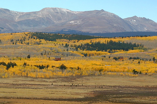
The colors seem a bit muted (possibly due to haze). Saturation adjustments could be made to make them "pop" a little more. I like the contrast between the yellows and the greens.
I could be mistaken, but that looks an awful lot like the "oh-so-treacherous" flanks of Mt. Sherman taken from outside of Fairplay. Sucks that you have to deal with that Colorado haze.
Lovely vista. The warm golds are soothing and certainly denote fall. I like the structure in the background - it helps give your eye a place to rest amidst the splendid panorama. I can see this as a postcard!! "Thinking of You" would work for this shot too!!







 Add photograph to your favorites
 Add photographer to your favorites


 Photographer found comment helpful.


