Wonderful! i could never match the expert critiqueing of the Critique club (therefore their nome... :D) so, i am simply going to agree with everything louddog has said! (only u've been in my favs for a while, lol)
First off, I added you to my favs list because I realize I neglected to add you before. You are easily one of the best photographers on the site (in my opinion).
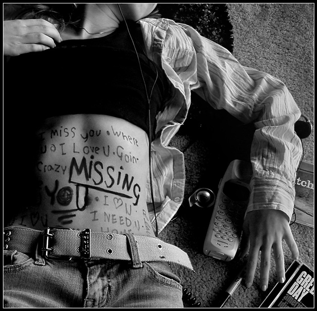
On to your photo… I think it’s perfectly done for what you were going for. The lighting is perfect, the props are great and I like that you have the marker there by your hand (Green Day rocks BTW). And what a great idea! The photo definitely gives the mood of a love struck teenager separated from their love. The writing is like random thoughts, the differences in size shade and capitalization also makes it seem more random, really giving the photo that emotional touch. But a permanent marker? Ouch, I bet it was fun removing. Next time just use a washable marker and use the permanent one as a prop :)
While it’s not a traditional greeting card with flowers or puppies, I do think it fits the challenge well and personally I like it better then the flowers and puppies. I don’t shop for cards very often, but I know in the last few years cards like this are starting to pop up. Sending a card like this to someone would really get your message across.
Great job as usual. I always look forward to your next submission.
Very cool!!! Awesome in B&W. Nice mix of tones here. I think it's a good fit with the challenge. EDIT: After reviewing all, I really like the unique modern feel of this. I'ts perfect for the younger generation. Good job!!
Wonderful, creative idea. And executed very well. Great focus and clarity. Interesting composition. I could see this as a card. Super job, I really like it.
This is super imaginative and I like it VERY much. My main complaint would be all of the "props." The Green Day album, pen, portable phone, etc don't really add to the shot. I mean, they probably refer to the person specifically that you miss, but for the general buying public, I think no props at all, other than maybe something that denotes missing a person on a more generic level. Does that make sense? Since all of the words are kind of busy and your eye is reading them, maybe no belt on the jeans too. It might be kind of schmaltzy, but maybe holding an empty Valentine candy box, or a picture frame turned away from the viewer, so you just see the back of it. Just me rambling and thinking out loud here. The shadows and ligh tare excellent. The placement of the figure's torso to the far left works well too, Without all of the props, there would be more negative space, which would give it more of a lonely feeling in my opnion. Have her laying on grass instead of the rug too like she's outside day dreaming of the person she is missing. Hope all of this is helpful. You certainly have a great eye for detail and the composition is good - just maybe a few less things would work for me. GOOD LUCK 7
I like this a lot... I might have gone without a couple of the items on the right, though. I think the Green Day album, etc., could have probably been left out and it would have still been just as effective.






 Add photograph to your favorites
 Add photographer to your favorites

 Photographer found comment helpful.


