|
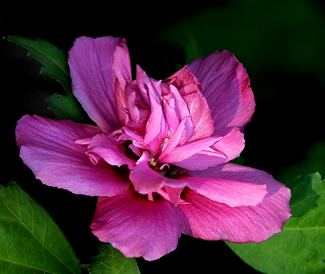
Very pretty. It seems almost a tad oversharp to me. Maybe it's my monitor. I like the contrast of the hot pink and the green. Maybe a bit more negative space would have worked. I might've cloned out the leaf in the lower right and that would have given that extra bit of background. The lighting is good and helps to detail all of the different areas of the blossom and highlight the variation in color of the petals. |






 Add photograph to your favorites
 Add photographer to your favorites


 Photographer found comment helpful.


