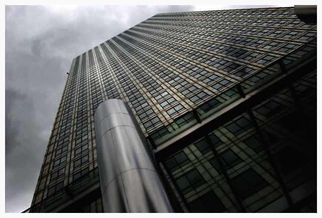
From the thumbnail it almost looked B&W and although the colours are quite subdued (ugh, spell?) they work really well against the intensity of the sky/clouds. Good luck with it. (8)
Nice urban shot. I like the single word title. If the sky were blue it would take on an entirely different viewpoint but with all of the gray tones, it is monochromatic and works well. 7
I don't like the use of border here. My eye is drawn to the muddling of clouds and border on the upper right edge. Perhaps adding a thin black line on the inner edge of the white border might help.






 Add photograph to your favorites
 Add photographer to your favorites


 Photographer found comment helpful.


